Project Type
Brand & Identity
Tools Used
Adobe Illustrator, Photoshop & Google Slides
Role
Associate Brand Strategist
Year
2020
When I was put on the Q Branch brand team, I knew the process would need to be fast-paced and involved. In the span of six months we audited, interviewed, and redefined not simply how we looked but how we felt in our overall voice and tone as a full-stack agency within Salesforce. The most sought after group within the Salesforce sales organization went from a piece-meal conglomeration of disconnected sub-brands to a fully united master brand with one voice and one mission: Together we win.
Over the years since Q Branch was formed, most of the individual teams had created their own look and feel, and oftentimes used their own logo. This alongside internal organization restructuring, and new product launches had led to a confusing array of disconnected teams and tools that our sales team customers had to navigate to work with us.
Because of the brand team’s dedication and focus, Q Branch is a more unified brand with the Salesforce sales organization at its heart.

Defining the Mark
The name “Q Branch” was created as an allusion to James Bond and his quartermaster “Q”, because Q Branch armed sales teams with the resources to successfully sell. However, this allusion was never explored in a visual sense and because of this the name and logo never truly held much meaning.
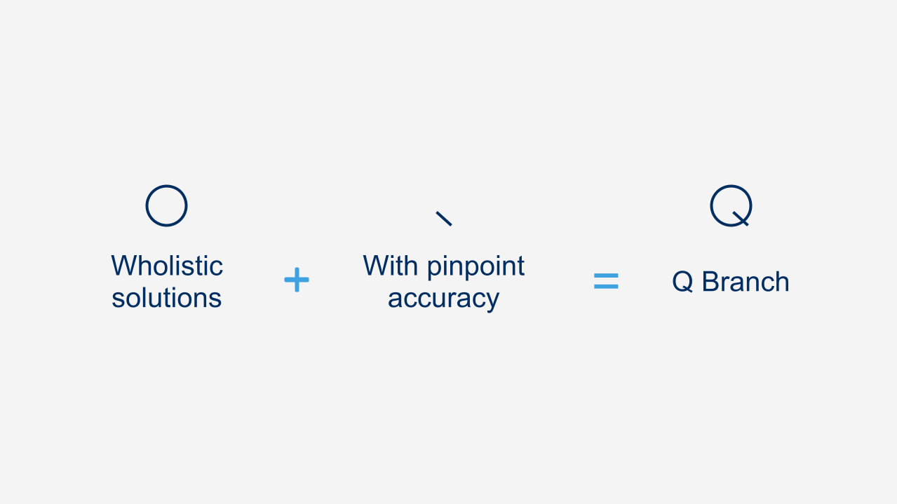
To address this, we explored visual explanations for the logo mark, and landed on the Q representing a power button turned at an angle. The power button represents how Q Branch “Powers the Success” of Salesforce’s sales teams.
Brand Guidelines
Being an internal, small organization at its inception, Q Branch never created a style guide to refer back to for any of its communications or visual direction. The final output for this project was a 39 page brand guidelines Google Slides deck that could be easily shared with all Q Branch members worldwide.


